Ópticas CV Plus · Branding Project
VISUAL IDENTITY DESIGN
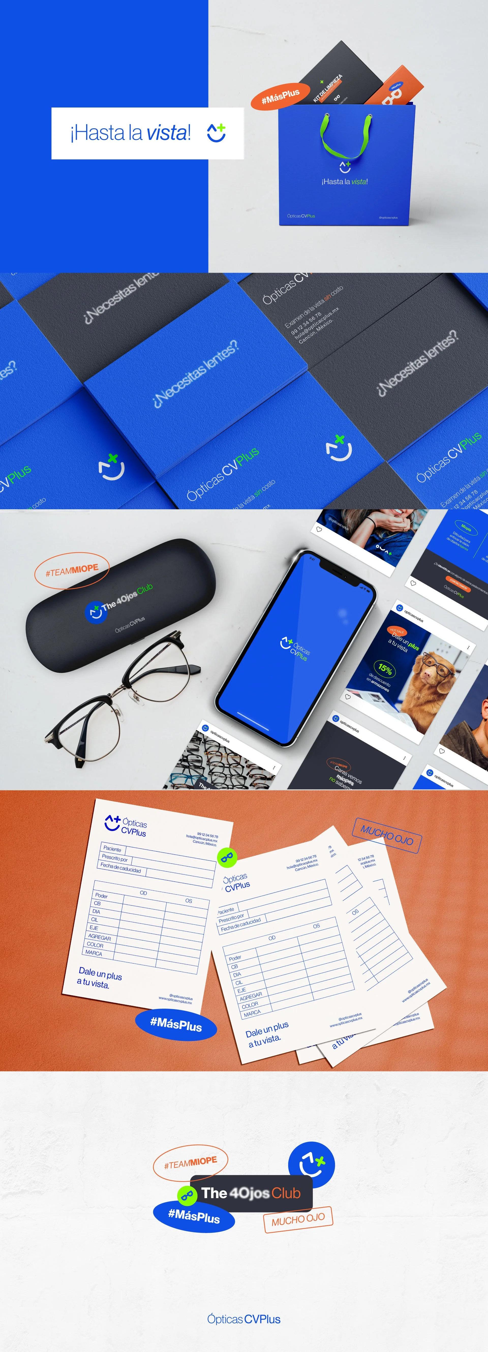
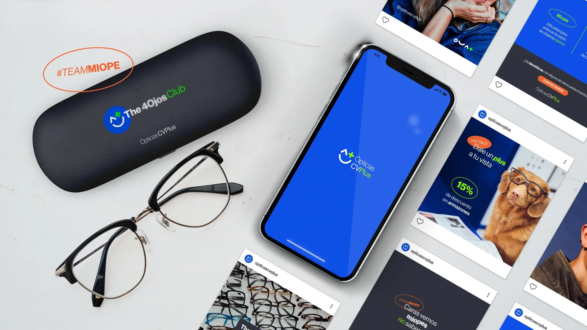
Opticas CV Plus aims to provide fast and efficient service by evaluating the health of the eyes and determining the quality of its customers' vision, while advising them on choosing from a variety of frames and eyeglass styles that best suit their personal style and visual protection.
Visual Identity Design First Approach

The process of defining the brand's visual identity focuses on the isotype, which is a set of symbols representing the C, V, and the "+" (plus), referencing the brand's name and simulating a satisfied face. This reflects the main goal of ensuring happy customers with the optical service. To achieve this, bright colors, sans-serif fonts, and secondary graphics are proposed to give the brand a fun yet professional touch.