
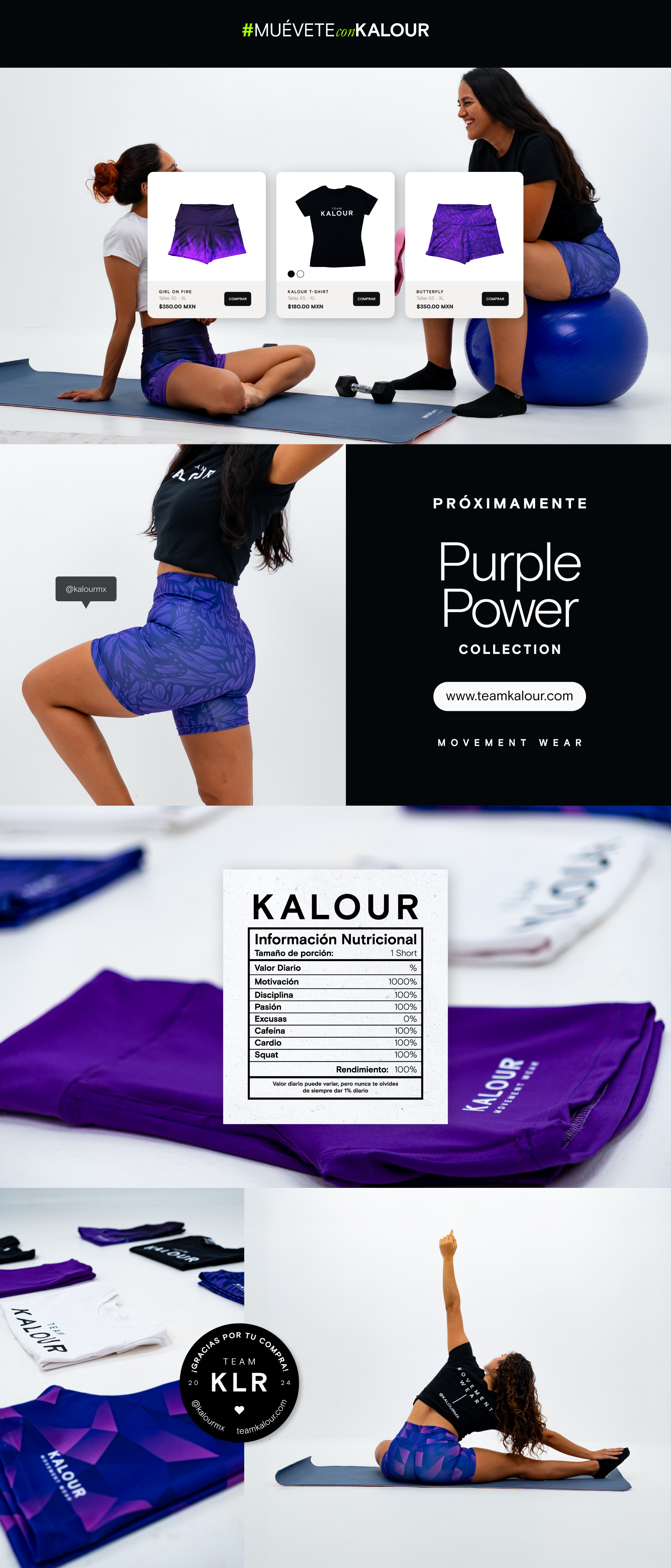
Naming
The name combines the words calor (heat) and colour, reflecting its roots in southeastern Mexico, where tropical weather prevails. We aim to offer breathable, comfortable fabric products with unique, colorful designs that inspire you to stay active and on the move. Our garments are ideal for high- and low-impact training or even for everyday wear.
Visual Identity Design First Approach
The creation of the logo was a quick process, as I had a clear idea in my mind of how I wanted the visual identity to look and how it would translate into the final product. I chose sans-serif fonts that reflect a minimalist, fresh, and easy-to-remember brand, setting it apart from competitors. The quality of the product itself would convey the brand's essence, with the goal of being memorable to the customer.
Social Media Design
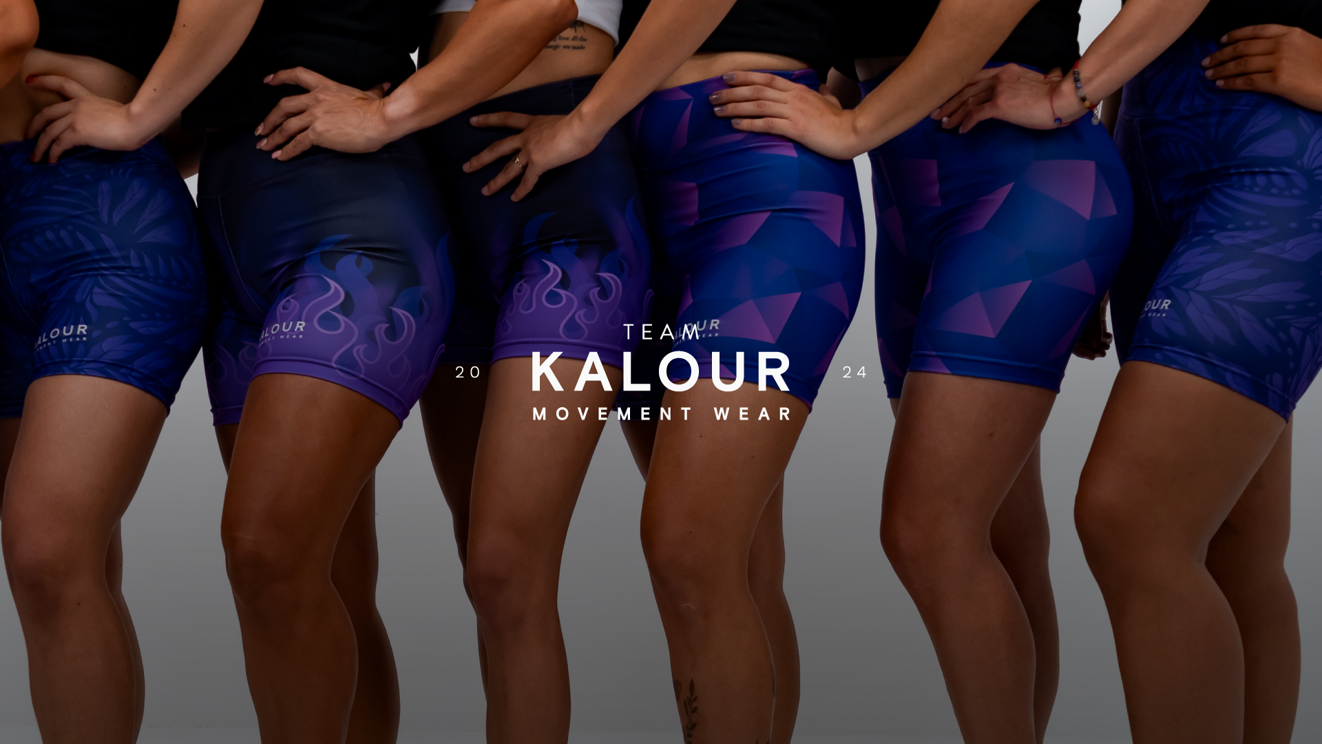
Team KALOUR's presence on social media reflects a minimalist design aligned with its visual identity, featuring a neutral color palette. This approach allows the design and color of the product to take center stage, sparking curiosity in potential customers.
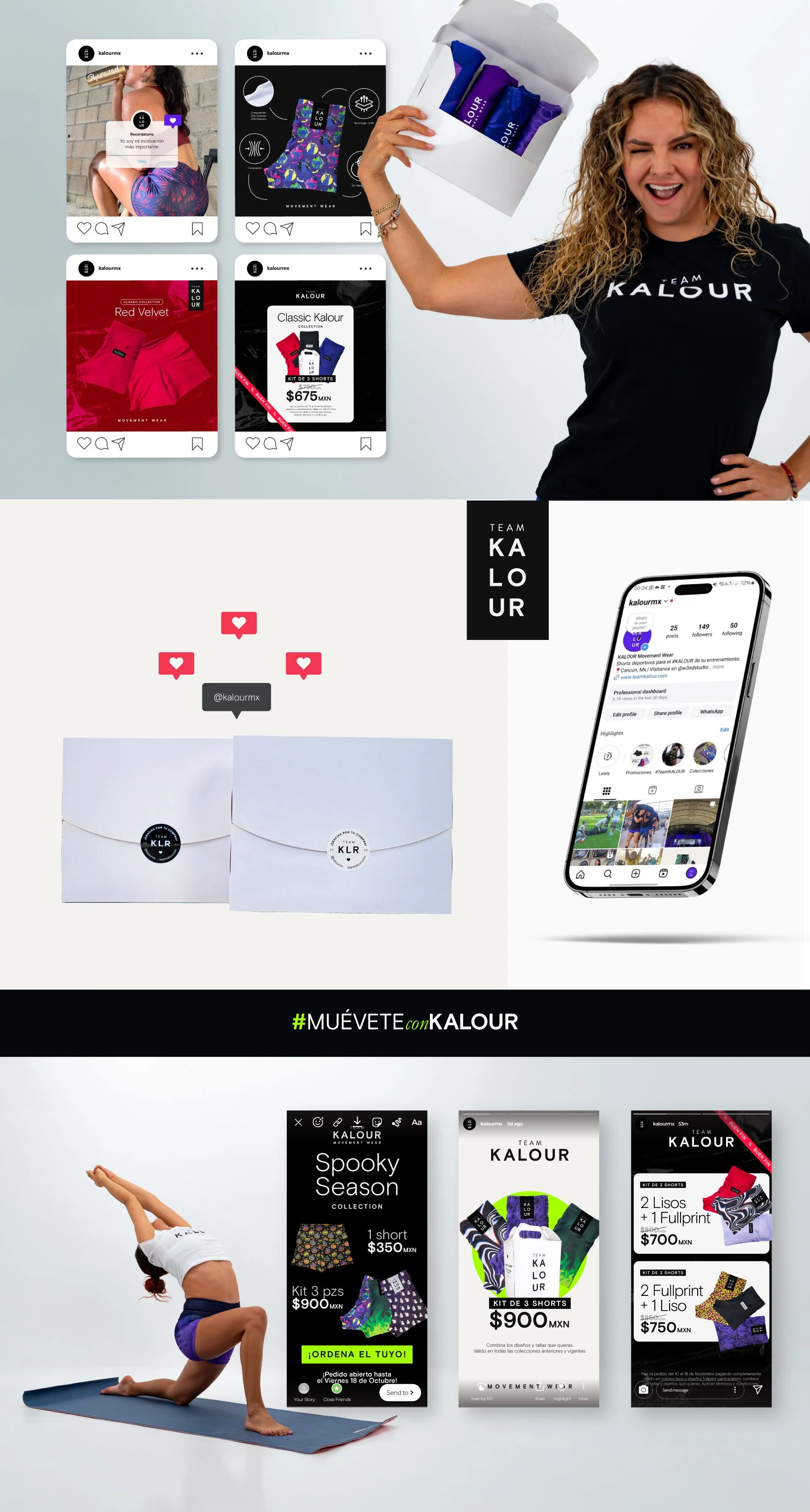
UX Design
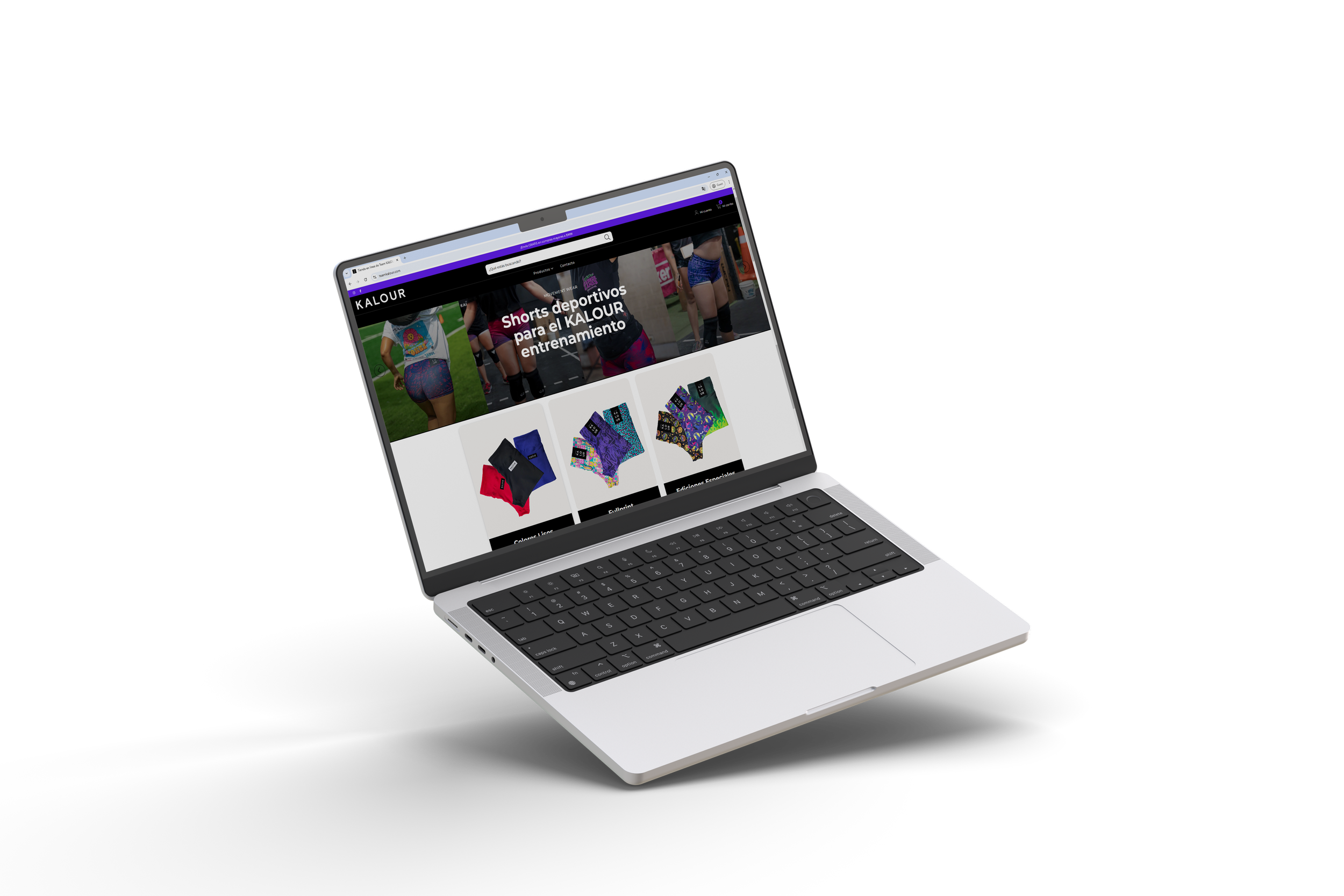
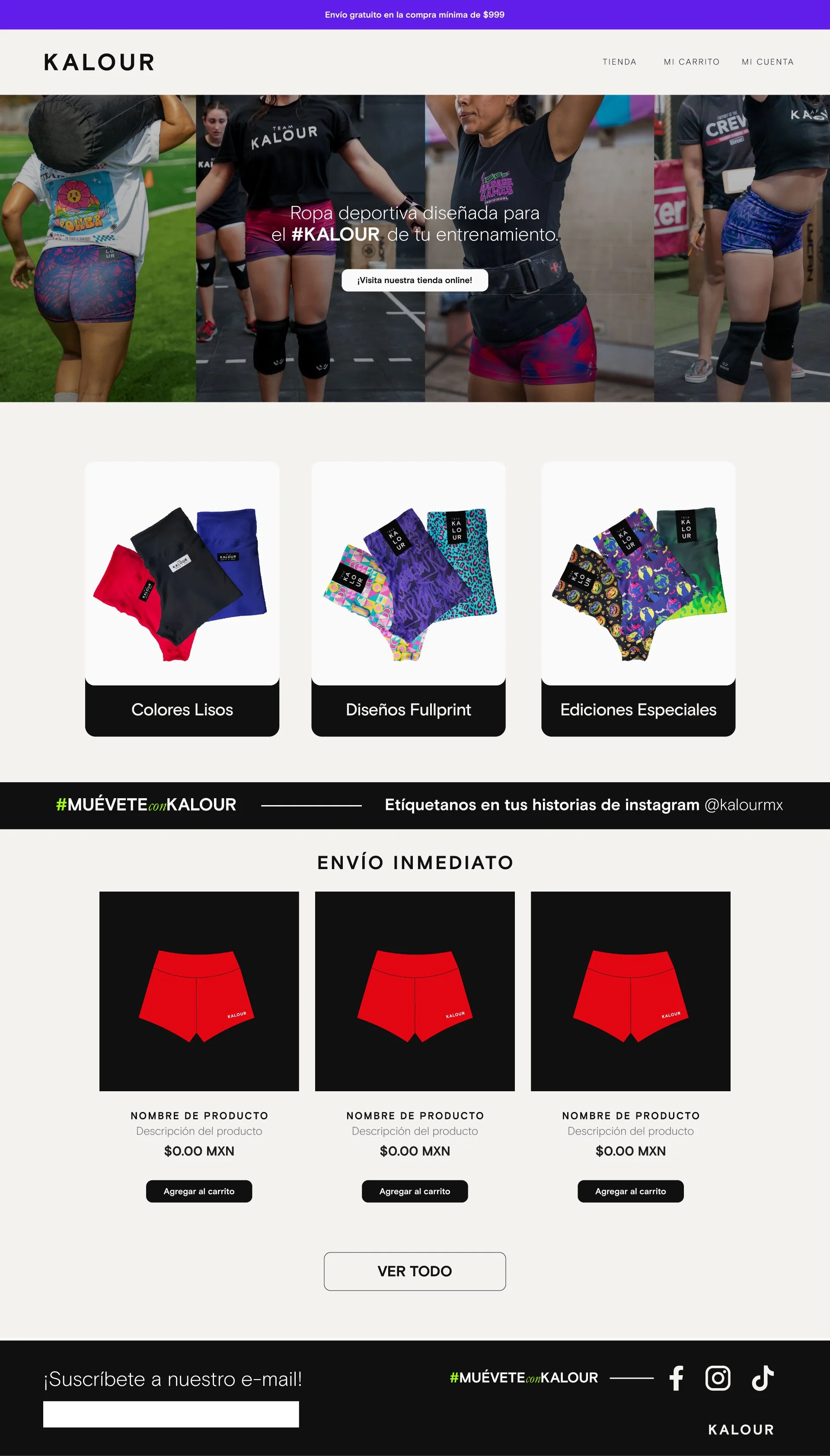
The website design, tailored specifically for public sales, emphasizes a straightforward and intuitive layout to ensure a seamless browsing and shopping experience for users. Every element of the design was carefully considered to create an accessible and visually appealing interface, making it easy for visitors to navigate, explore products, and complete their purchases efficiently.